Finding the right visual register for a sport mark is never simple. Too refined and it loses credibility and too aggressive it disappears into generic sports territory. La Golondrina sits firmly and comfortably between the two. The sharp, dynamic edges carry the speed and confidence of a sports identity but the form is softer and rounder bringing a warmth landing its place in both worlds.
The trusted global voice of women in padel.
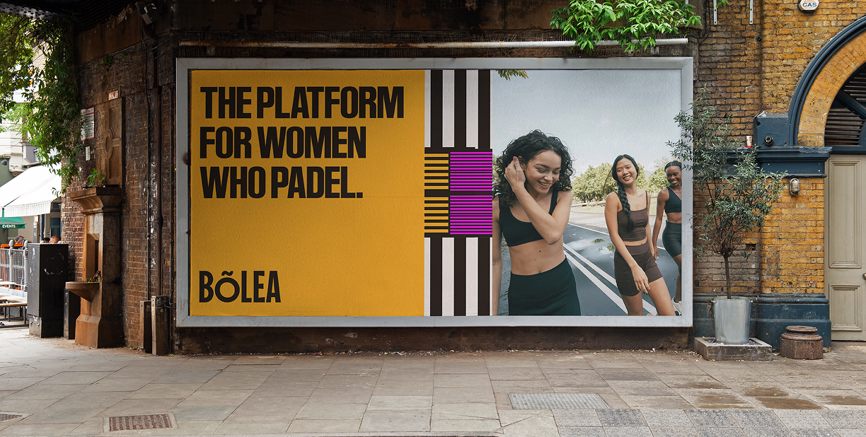
Naming and branding one of the worlds largest padel platforms, built on a global community of women in padel.
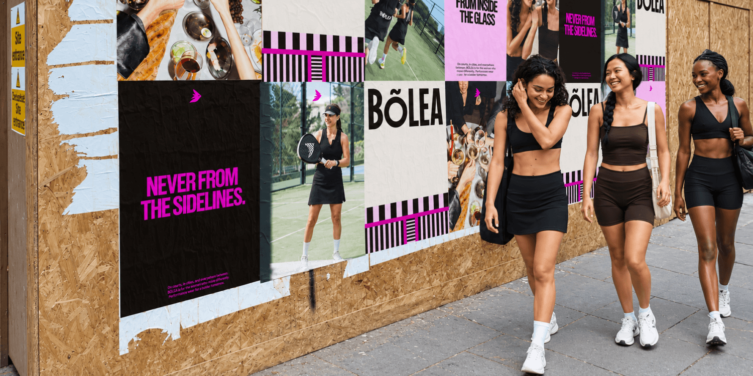
A sport growing faster than its own culture.
Padel is one of the fastest growing sports in the world. Thirty-five million players globally, and women make up forty percent of them. Padel culture by contrast is still in its infancy, the media, the vibe, the community around the game is going from strength to strength and Bolea is looking to tie it all together.
The founders saw the gap and decided to fill it for their global female padel community. Two sisters and padel players, successfully organising global events and building the world’s largest female padel community before anyone had built the modern infrastructure for it. Bolea didn’t start as a brand strategy, which started as a simple truth, 40% of padel players around the world needed a platform that felt like theirs.
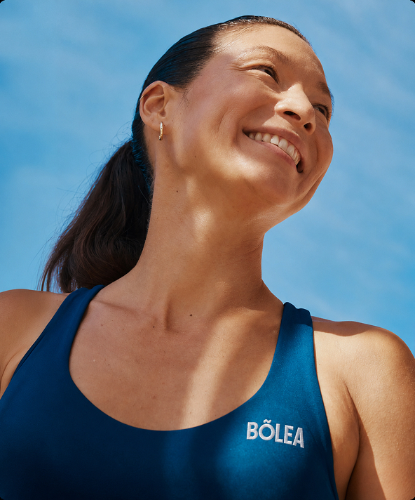
Renaming an established platform by doubling down.
Naming is arguably the hardest and most important part of the work we do for any client, making the final decision is a huge leap of faith. We explored a variety of territories tho the first question we had to answer was how prescriptive did we want to be, would words such as “female” or “women” feature in the name at all.
There are plenty of arguments either way and there are plenty of female first sports platforms that follow a prescriptive trend: Females in Motorsport. Girls on Track. Women in Games. Our founders were no different initially trading as FemPadel to gain traction in search and mindshare, but after some late nights and long workshops the decision was made to move FemPadel into a world calling on more lifestyle and editorial influences.
Padel was founded in Mexico and has the largest audience in Spanish-speaking countries. Bolea is the Spanish word for a volley, the shot played before the ball touches the ground. It’s recognisable to anyone who plays, and completely ownable outside it. It doesn’t outwardly say female but it feels feminine, ending with an a which as a recognisable trait of female words across the Spanish language. It belongs to the game and to the women who play it.
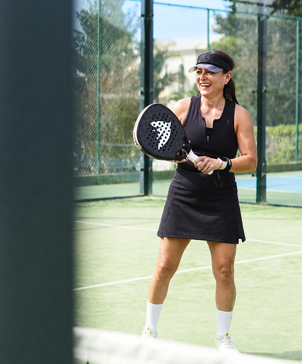
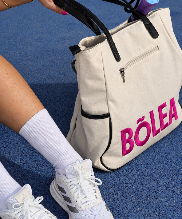
A logo mark built around La Golondrina.
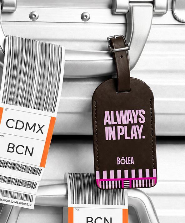
La Golondrina is Spanish for the swallow, a bird that migrates between Mexico and Spain, the two countries at the heart of padel’s history. It travels thousands of miles across continents, but always comes back to the same nest. Similar to the Bolea community, it’s spread across the world but connected by the same game.
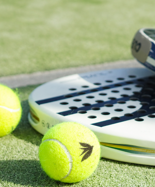
Creating something dynamic from something rigid.
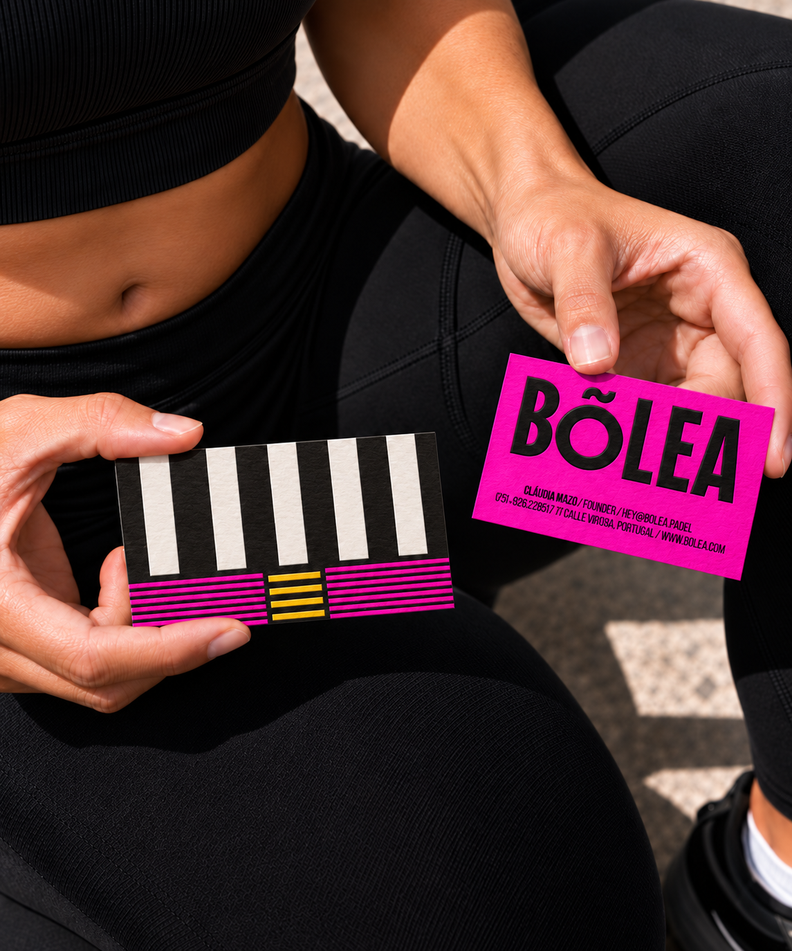
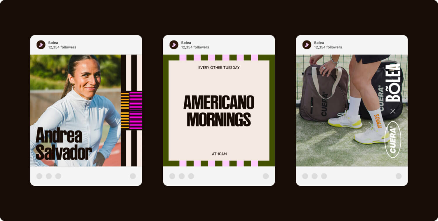
One of the most common problems facing our start up clients is feeding the demand for unique content without having to rely on a design agency every time they want to create something. The solution we reached for Bolea was to create a unique pattern generator. Taken from the simple linear markings of a padel court, combined with a random arrangement algorithm and the Bolea brand colours the client and their team can create an infinite amount of graphics to support documents, posts and comms.’
The outputs can be as simple or complex as the user wishes and export in a variety of formats to import into any software or print media. As the founders of Bolea travel the world and are constantly on the move we sat the generator itself on a subdomain which can be accessed and used on mobile allowing comms generation on the go.
The challenge.
The brief contained a tension that most brands in this space had failed to navigate. Build something for women without making it feel like a women’s version of something else. Create a platform that is inclusive without erasing the specific audience it exists to serve and speak to a global community without losing the warmth of the one that already exists.
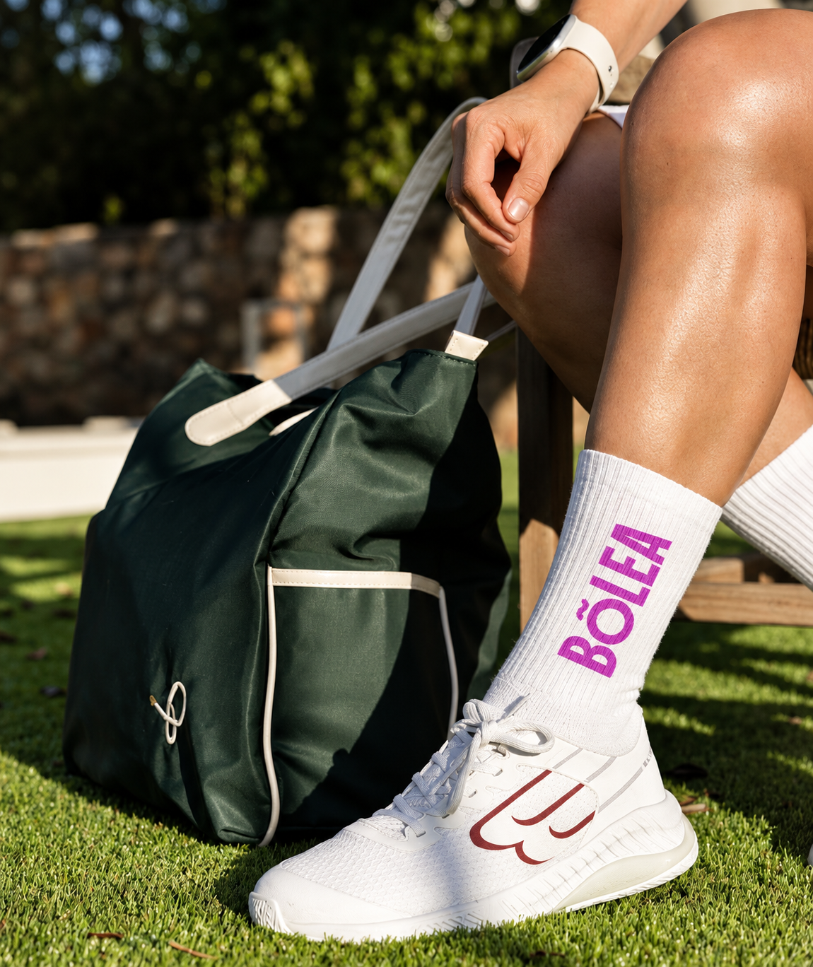
Every visual decision was pulled from the game itself. The mark of La Golondrina, the swallow that migrates between Mexico and Spain, the two countries connected to padel’s story, and always finds its way back. The colour palette came from the flora and fauna of those same two countries. The pattern system is built from the geometry of the court turned into a living graphic language through a custom-built generator the client can use. Everything grew from the court and the game itself. We started with Padel, not with Padel for Women, confident and at ease with the authority that comes from knowing the game from the inside.
How did we create feeling.
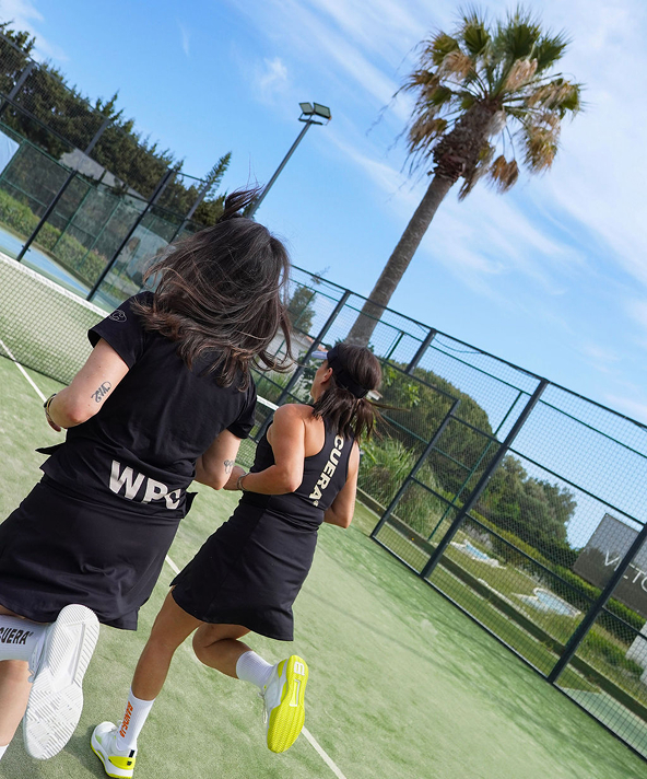
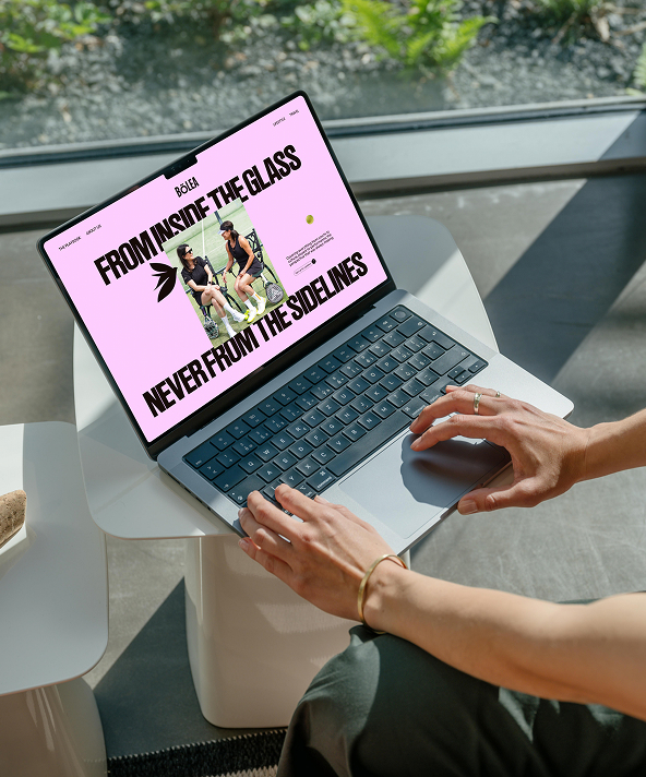
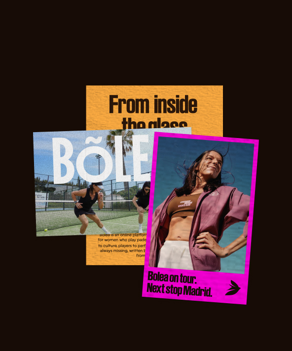
The identity was built around a single creative principle “inside the glass.” The padel court’s defining feature is transparency with its four glass walls, a sense of openness, that it is accessible, come and see, get involved, it is here for everyone but also a sense that Bolea know this sport from the inside out.
This approach to the brand allowed us to embody Padel as a whole and with authority, leading with the game and supporting with the community. The key emotive visual driver was a sense of belonging, more than a game you are part of something bigger.
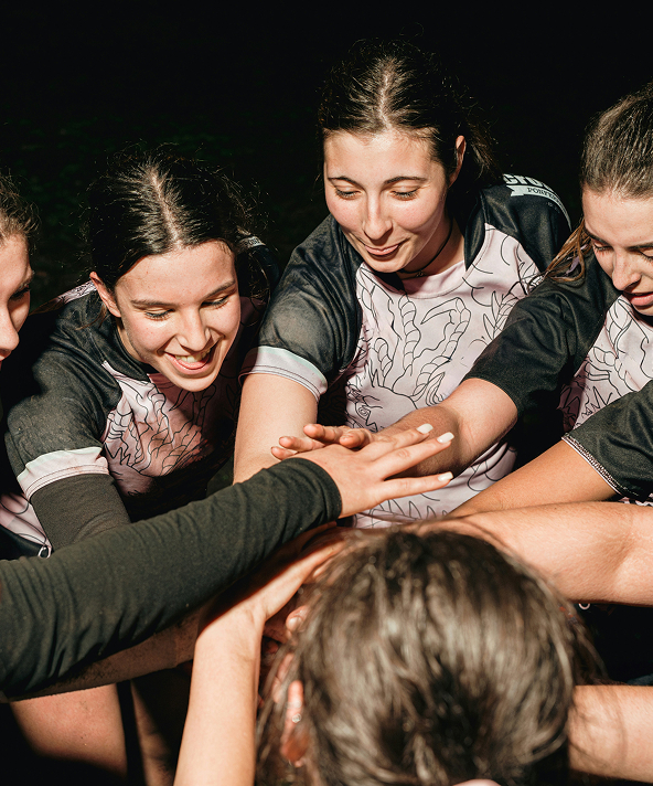
Padel isn't a solo sport and Bolea is a community.
Each game is played as a group of four with two pairs, a game that only works when you move together and read each other without words.
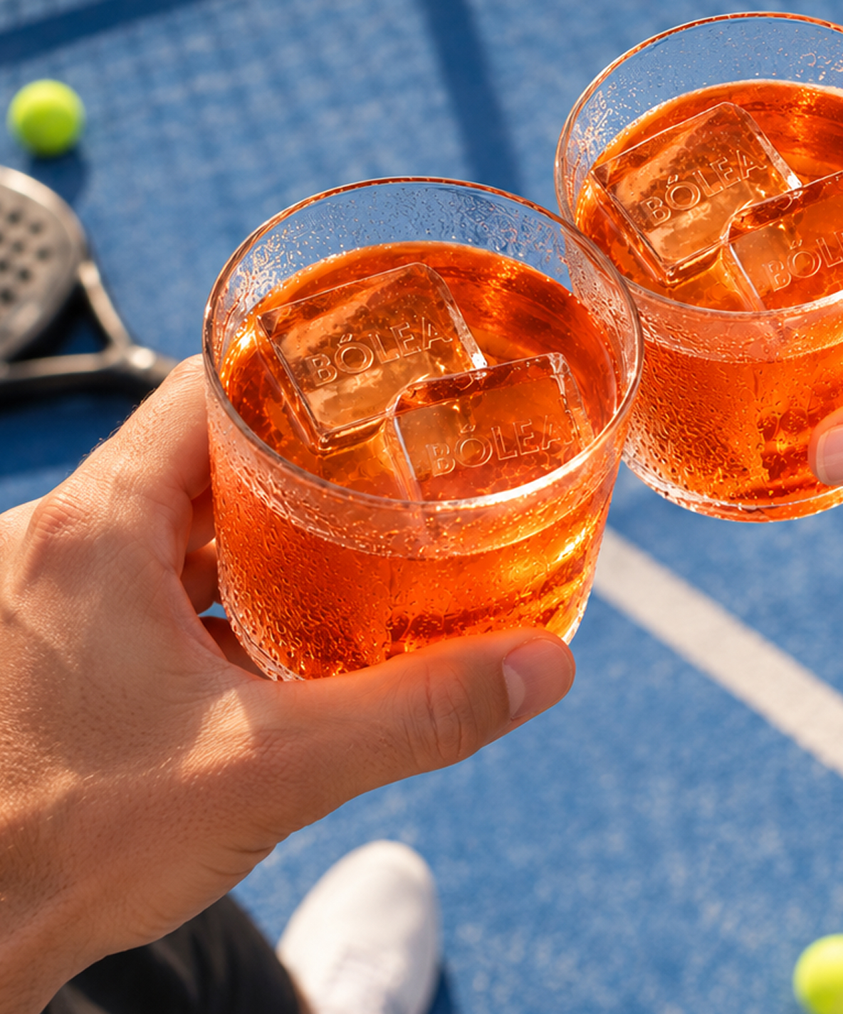
Bolea exists for not only what happens on the court but also what comes after the game ends. The tournaments that bring players together from across cities and countries. The Aperol after the match and the hours of conversation that come after it.
This is what padel builds and what Bolea is built around. Not only a sport but a reason to show up, a reason to stay, and a reason to come back.

0